Cartography
Designing the core Mapbox cartographic offering, collaboratively.
As Staff Designer on the Cartography team, I worked alongside a team of 3 designers, 2 data engineers, and the Mapbox Studio team to ship and streamline the core Mapbox cartographic offering. These six core map styles were general purpose maps emphasizing accurate legible styling of roads, points of interest, highway and transit networks.
During our 2016 redesign, I was responsible for the redesign for Mapbox Satellite Streets. We worked closely to create a streamlined design system that was both performant and visually cohesive, particularly on mobile.
During our 2016 redesign, I was responsible for the redesign for Mapbox Satellite Streets. We worked closely to create a streamlined design system that was both performant and visually cohesive, particularly on mobile.
MAPBOX SATELLITE STREETS
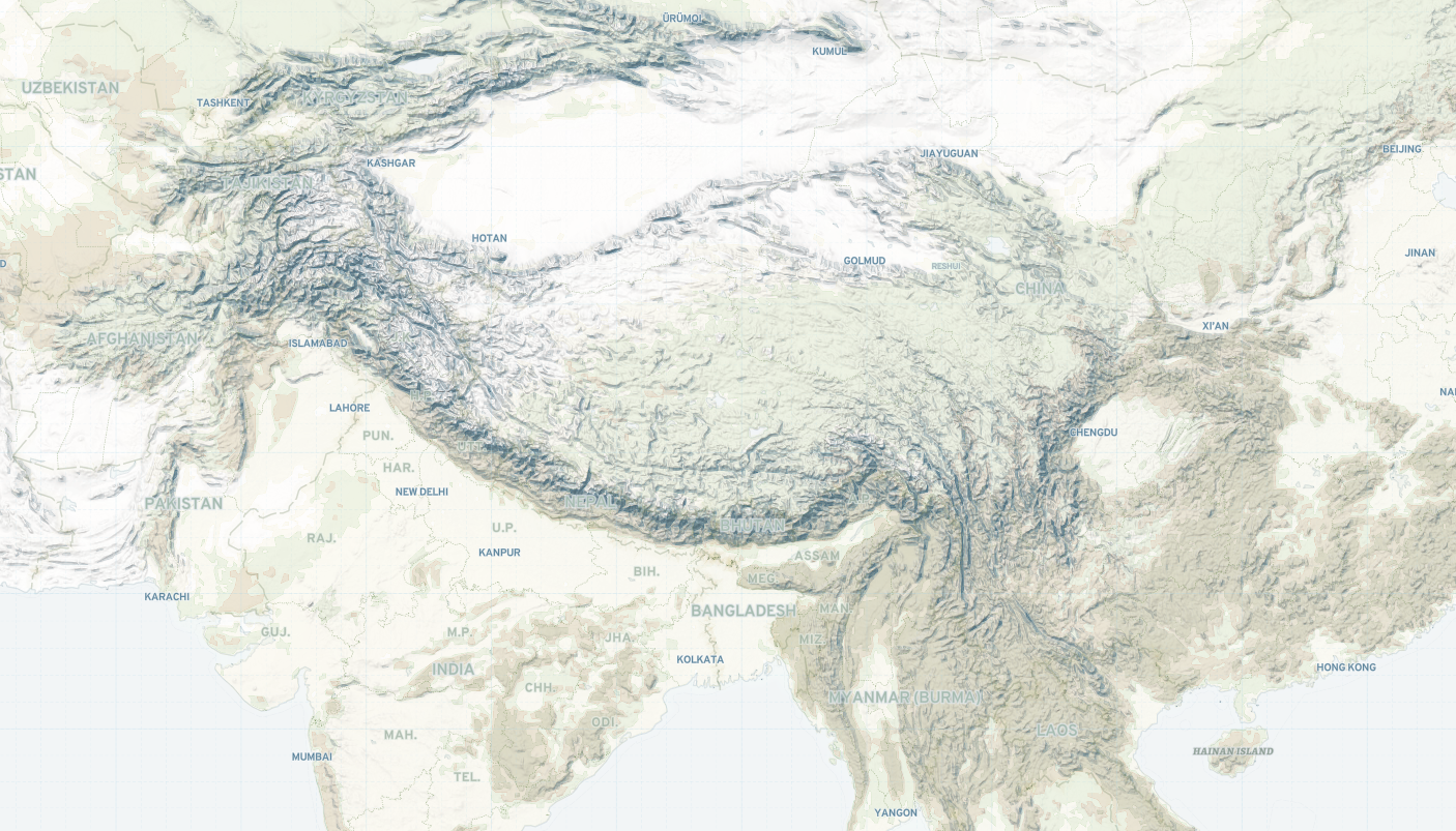
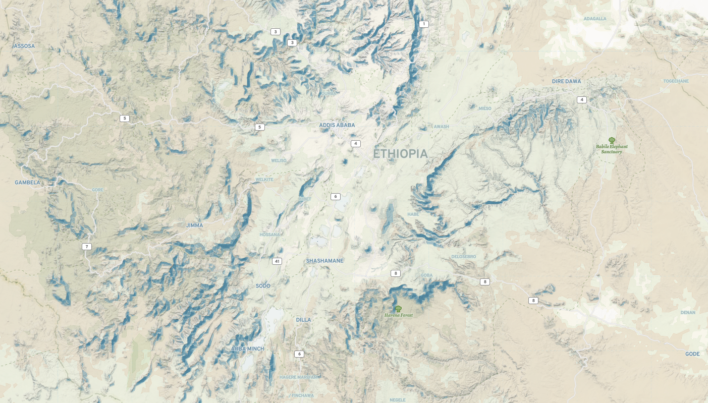
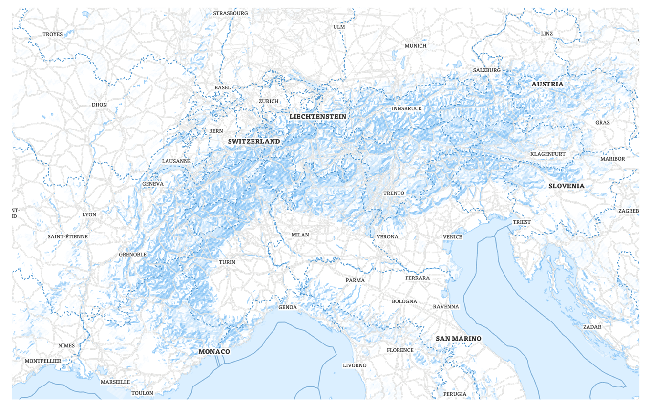
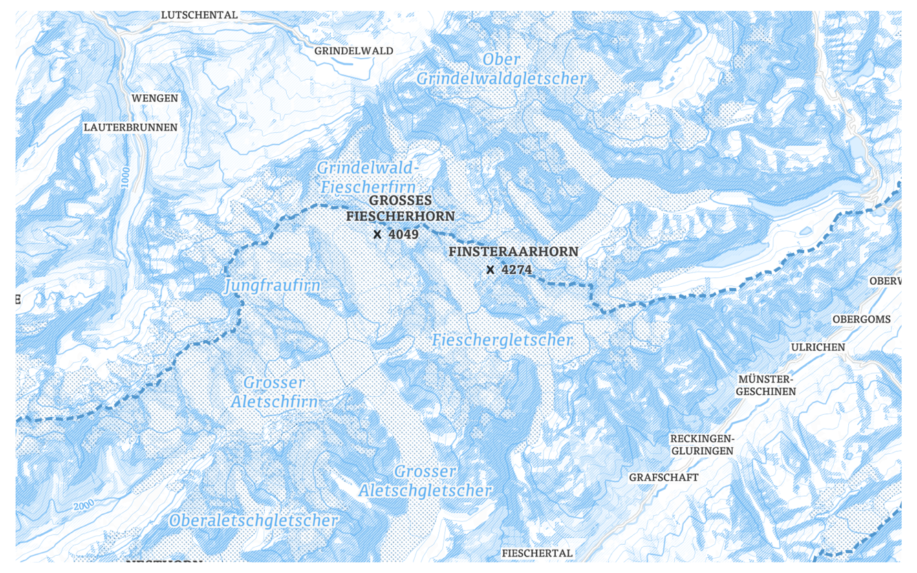
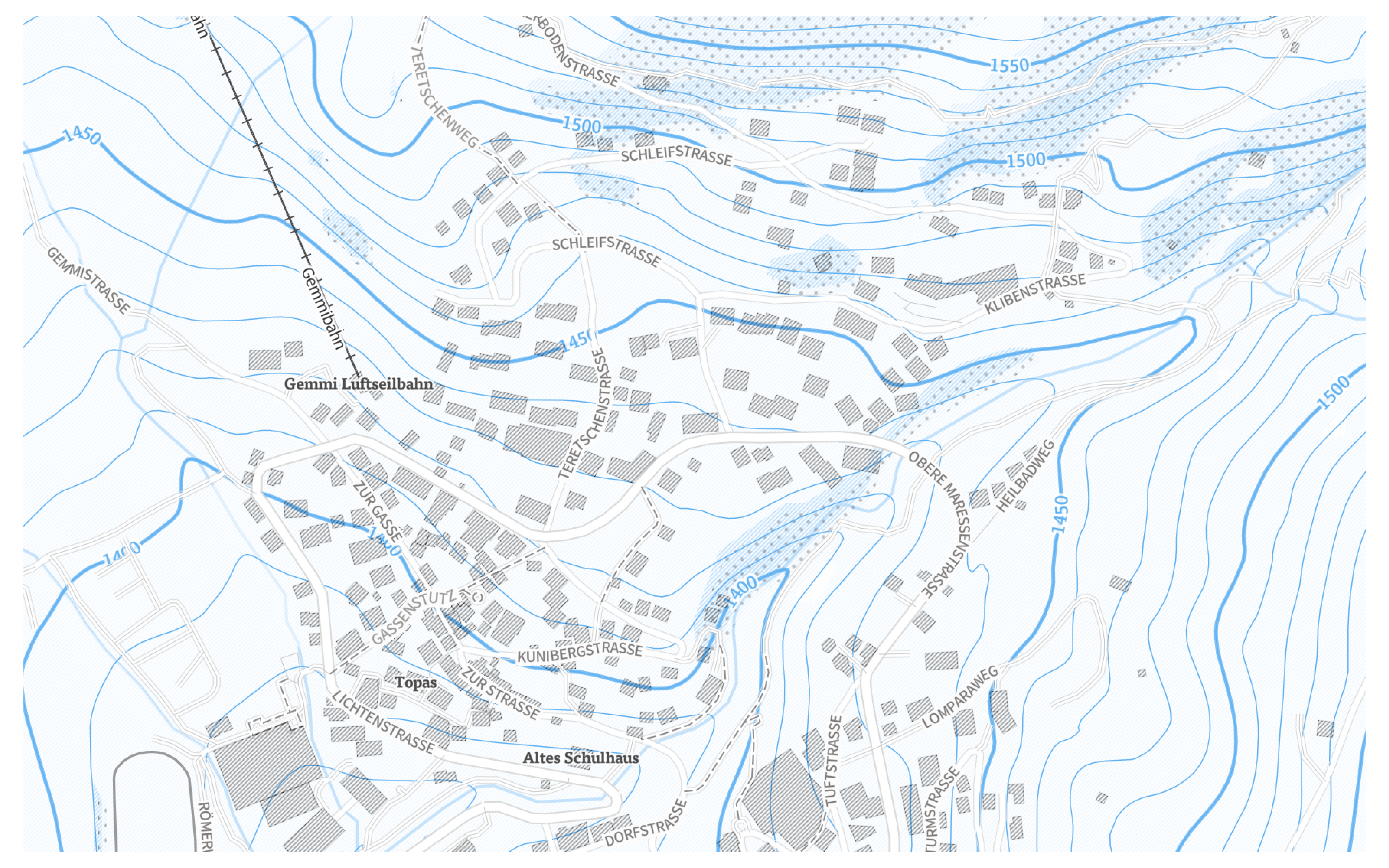
The challenge of Mapbox Satellite Streets was the vibrant, high-resolution background that varied across global locations. The road networks and typographic treatment needed a strong contrast across these varying backdrops. I worked tirelessly to push and pull between the foreground and background ensuring balanced legibility across 22 zoom levels altering the value decisively.

Varied styling across different terrain types

Icon treatment for consistent legibility
I designed a comprehensive set of simplified, modern points of interest icons. This created a pattern of visual recognition to acclimate users to landmarks making the map more navigable at the street level views.
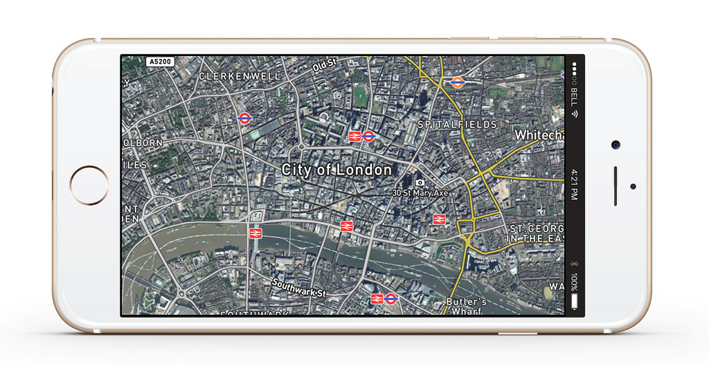
Particularly on mobile, my design decisions for heavier yet muted visual hierarchies on road networks for higher, street level zooms blended well with our established global transit stations, highway shields, and motorway exits icon sets.

Designing for mobile also required an iterative process for visual emphasize on popular ferry routes, and pedestrian and cycleways alongside the lush satellite imagery.
Read more
DESIGN SYSTEMS
Designing and managing a complete map style is a very iterative process of trial, error, and adjustments. As a team, we helped identify and build systems to maintain design excellence across 22 zoom levels, 90 data layers, and 600 icons.
Below are a few solutions we built together.
Below are a few solutions we built together.
CARTO-CAM
This tool allows you to enter a style and compare various locations across multiple zoom levels showing specific types of data. Helping us validate design decisions faster.
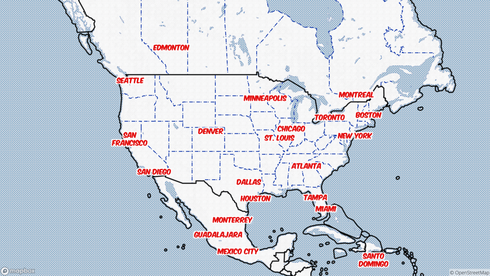
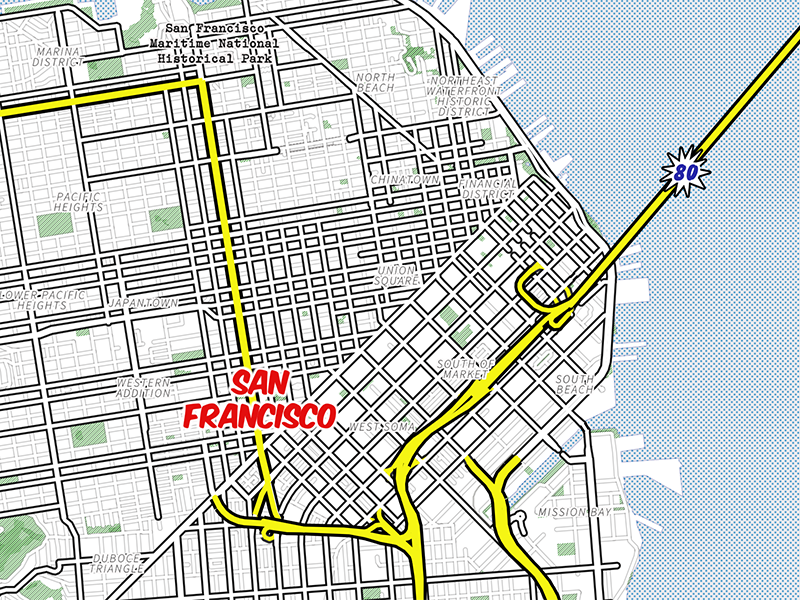
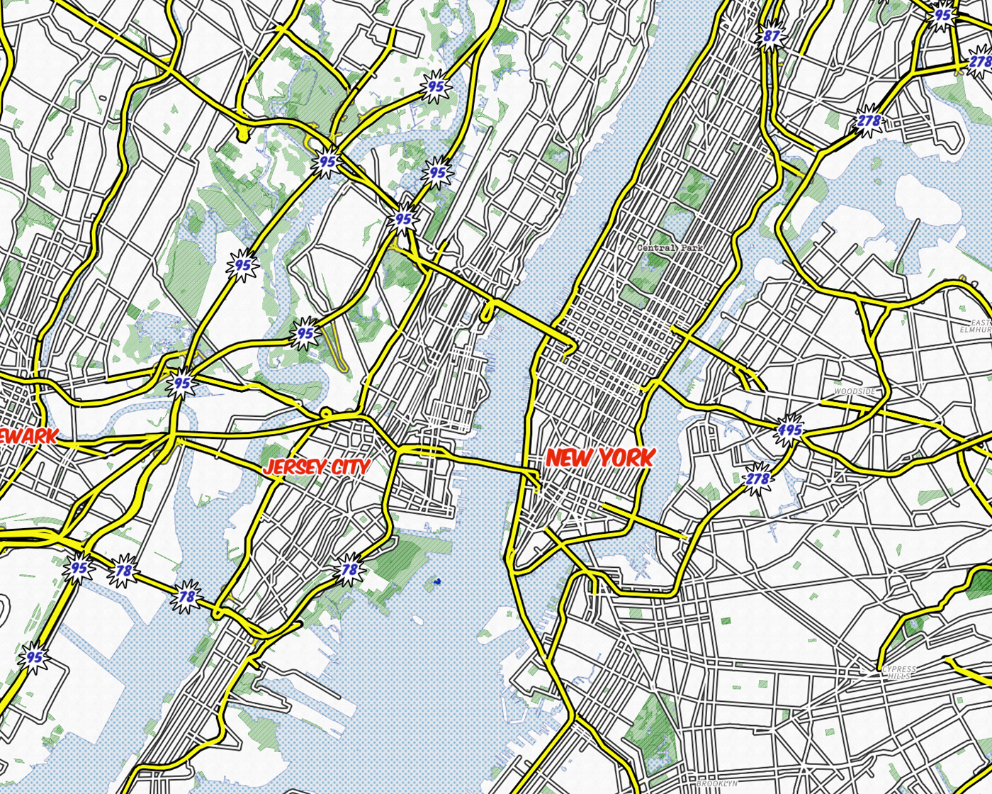
Designing a single map style for global use has its challenges. To start, road network both by data classification and visual interplay with other points of data can be drastically different from San Francisco to Washington DC. On a global scale, seeing your design decisions all together for different data types across the planet is critical.
Designing a single map style for global use has its challenges. To start, road network both by data classification and visual interplay with other points of data can be drastically different from San Francisco to Washington DC. On a global scale, seeing your design decisions all together for different data types across the planet is critical.
 Carto-Cam user interface with Mapbox Satellite Streets
ICON EDITORS
To manage the nearly 600 count iconography set required for each map style, we implemented two icon editors that allowed for bulk color, stroke, and classifications in one interface. The tool allowed us to download finished SVG files and both download and upload a JSON file that outlined each icons styling and class type.
This allowed us to keep the iconography styling spec in a central location easily editable by any designer that was tasked with the redesign.
This allowed us to keep the iconography styling spec in a central location easily editable by any designer that was tasked with the redesign.
 Maki icon editor interface
 JSON & SVG code-based for icon management
STYLE GUIDE GENERATOR
Around this time, I was also working to identify more generative ways to separate the final map design from the final design decisions. This could help onboard new designers to the team and also help designers check and QA their final maps for accuracy and consistency.
This work informed much of the future decisions we’ve made with simplifying the map design process in Mapbox Studio to this day with style components offering.
This work informed much of the future decisions we’ve made with simplifying the map design process in Mapbox Studio to this day with style components offering.
Mockups for StyleGuide generator concepts
Inspiring the “art of the possible” with visual map design.
My other focus on the Cartography team was to design a series of thematic map styles that highlighted ‘the art of the possible’ with the Mapbox promise of custom map experiences.
This work included blog post deep dives that explained and outlined different techniques and best practices for map design. Below are some of my map design, descriptions, and links to the blog posts.
This work included blog post deep dives that explained and outlined different techniques and best practices for map design. Below are some of my map design, descriptions, and links to the blog posts.
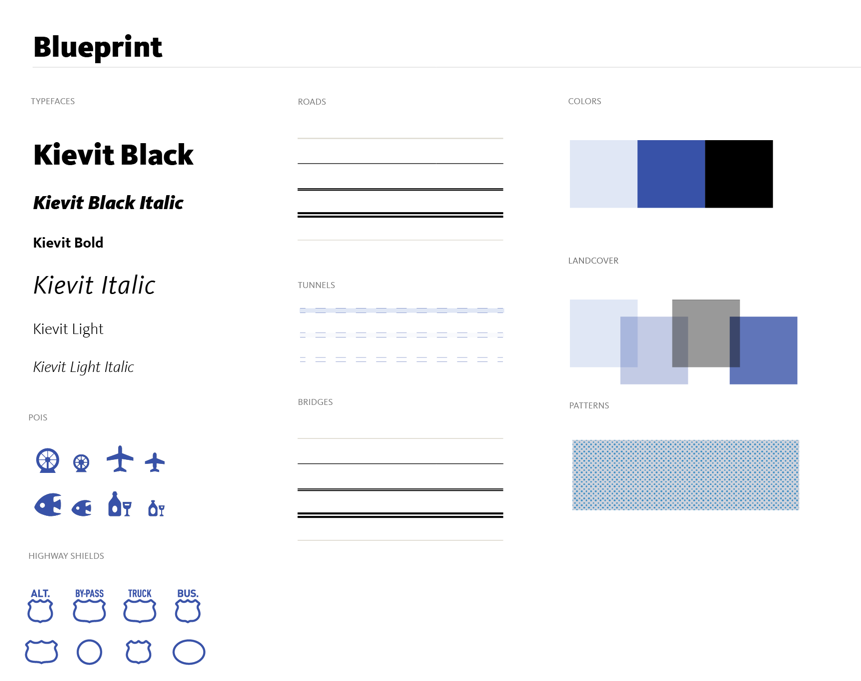
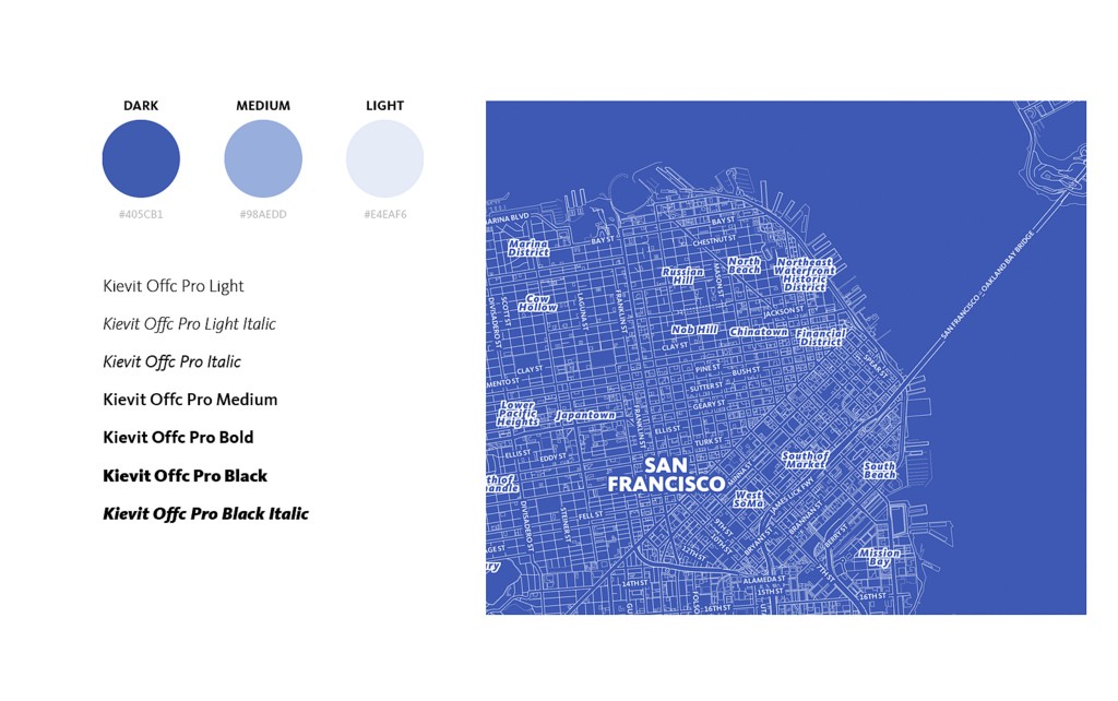
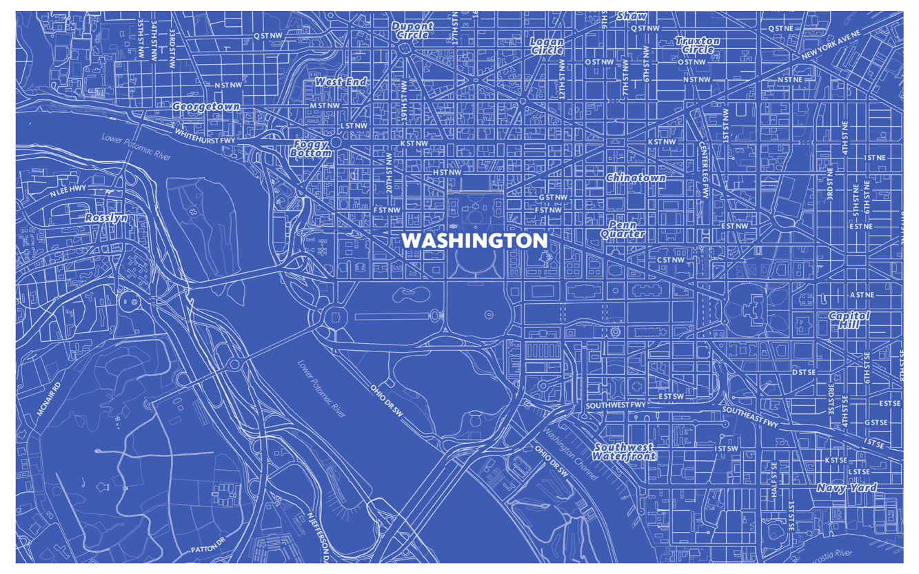
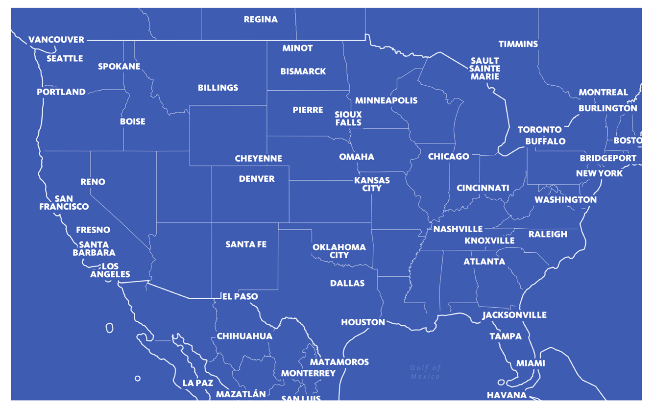
Blueprint
Inspired by U.S.S. Enterprise NCC-1701-D blueprint schematics, I designed the Blueprint map style. Eager to test the latest version of Mapbox Studio, my style took full advantage of the new Mapbox GL renderer which allowed from better font and labeling coverage over zoom levels. Since I love design constraints, I limited my color palette to three shades of blue and a single typeface, FF Kievit.
Read more
Read more
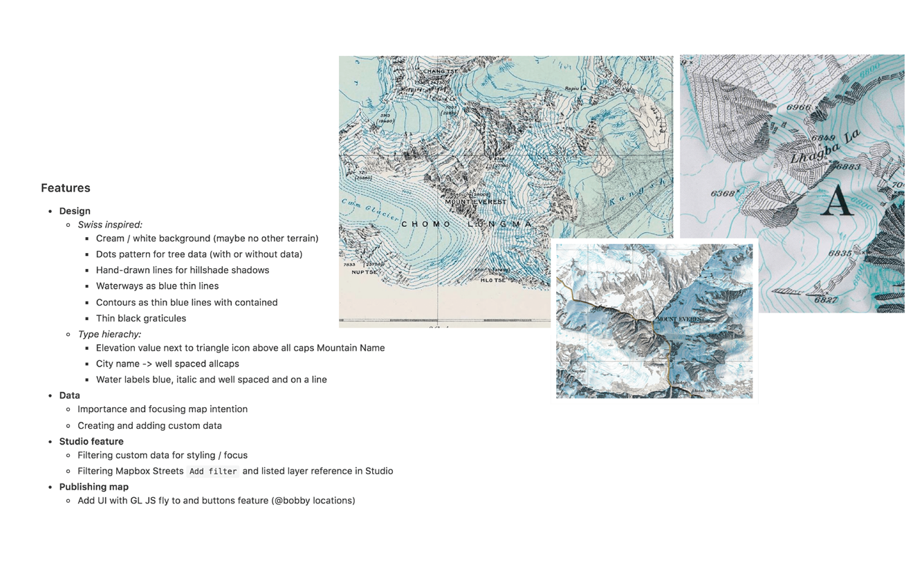
SWISS SKI MAP
Traditional ski maps feature steep slopes, ski and snowboard routes over a contour heavy topographic base. The topography creates a detailed visualization of depth of the natural features in the terrain. Inspired by Swisstopo maps, this style highlights elevation contour lines along with specific ski features such as gondolas, chair lifts, and piste paths.
Read more
Read more
THE VINTAGE
Vintage maps typically include detailed depth styling on the oceans and bodies of water surrounding the continents. This is bathymetry; the measurement of the depth of water in oceans, seas, and lakes.
The same way that topographic maps represent three-dimensional features of overland terrain, bathymetric maps illustrate the land that lies underwater. A feature I highlighted in this map style.
Read more
The same way that topographic maps represent three-dimensional features of overland terrain, bathymetric maps illustrate the land that lies underwater. A feature I highlighted in this map style.
Read more


Whaam!
Drawing inspiration from the likes of Andy Warhol, James Rosenquist, and Roy Lichtenstein, Whaam! is a unique base map for telling your story with spunk. The use of primary and secondary RGBs hint at traditional printing variations for a vibrant and playful visual read. My pairing of small, dark cyan dots closely spaced over a solid, light cyan background gives the viewer the slight optical illusion as they zoom into the map, in true pop art fashion.
Read more
Read more
LA Terrain
This map style was inspired by my first trip to LA. I’ve flown many times from the East Coast to Pacific Northwest, but this was my first to Southern California. The Grand Canyon, Navajo Nation Reservations, thinly populated deserts and mountains in San Bernardino County; all inspired this vision. I wanted this style to capture desert and mountain-scapes from the window seat.
Read more
Hear podcast interview
Read more
Hear podcast interview